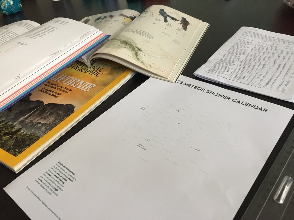
Prior to their annual event, the International Meteor Organization asked its members if they had a poster to share. Although I was unable to attend the event, I submitted a poster in the form of a visual meteor shower calendar for 2023. The organization responded that they could include this poster in their quarterly journal on the back cover. Since their print size is A4 and the version I submitted was intended for A2, I had to check if the current version was acceptable as is or not.
I selected some of the smaller parts of the poster text and printed the corresponding selection. I then compared the size of the text to the small text in some of the National Geographic magazine infographics. The text was small, but most of it was still readable. Only a few names that I had trouble getting in were very small.
Since I didn’t know the margins that would be used for the final print, I decided to make some changes to the layout to remove the smaller parts. Here are the 2 versions: Can you spot all the changes between them?
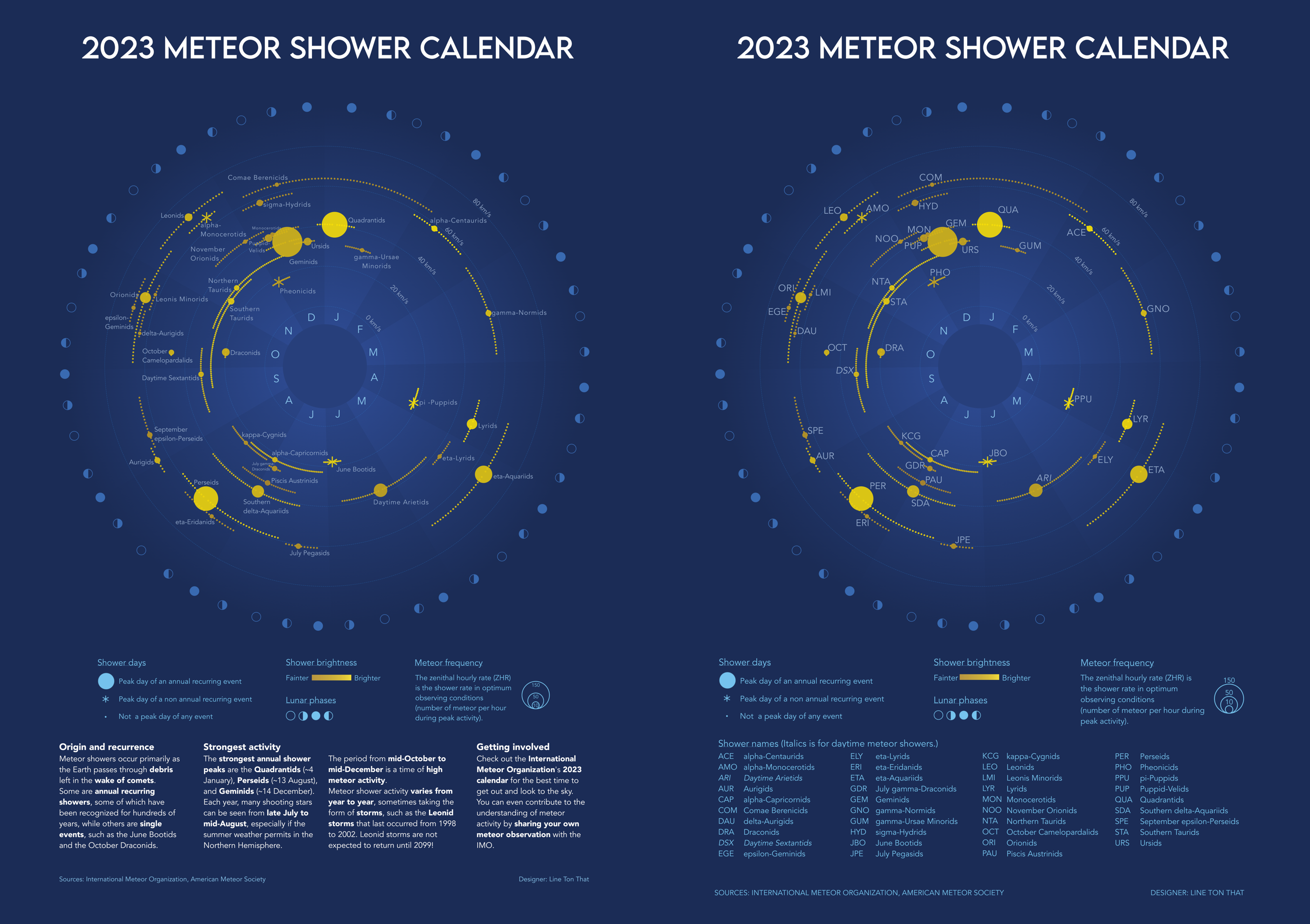
Did you spot them all? Here are the changes from top to bottom:
- The name labels for the meteor showers have been replaced with their 3-letter code. Within the organization, this seems to be a very common way of naming the showers, from the tables published in their journals to the articles on their website.
- The font size of the meteor shower labels has been increased.
- Whenever possible, I placed the label in the upper right corner, next to the peak day visual mark, as this is the best position for labels in the western world (?) (see Data visualization handbook, Koponen & Hildén, Aalto University, p. 270). Of course, things are not always this easy, and for the November-December period, I just tried to place everything, in the closest position possible. This task could be quite similar to labeling a map, and for now, although automatic placement of text on the map helps a lot, manual adjustment is still necessary (ibid, p. 269).
- The label for daytime meteor showers has been italicized to mark their difference. This may not be so obvious, and I could have used an asterisk instead.
- The font size of the legend below the graph has been increased.
- The text in the legend has been spread out to line up with the list of meteor shower names below it.
- The size of the meteor frequency legend has been updated with the zenith hourly rates (ZHR) above the corresponding circles. I find this arrangement generally more readable.
- The general text about meteor showers at the bottom of the page has been replaced with a list of the full names of the meteor showers corresponding to their 3-letter code. This old text was more suitable for a general audience than for members of the International Meteor Organization. Alphabetical order was used, rather than chronological order, as I found it easier to search for a specific name.
- The credits were moved to the bottom of the page to have more space for the list of shower names.
- Capital letters were used for the credits, instead of lower case.
Adapting the layout for different formats was a good opportunity to put the whole poster into perspective (what the audience would know and look at), and to be somewhat confronted with the problems associated with map design.